


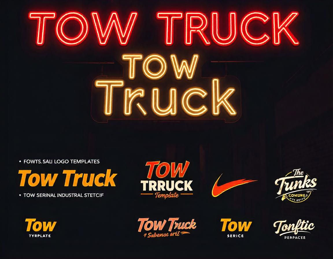
A well-designed tow truck logo should be easy to recognize and communicate trust, reliability, and efficiency. While symbols and colors play a significant role, typography can be the defining element that makes your logo stand out. The right font choice not only enhances readability but also sets the tone for your brand.
The Power of Typography in Branding
Typography is more than just selecting a font. It affects how customers perceive your business, influencing their trust and confidence in your services. A strong, well-balanced typeface conveys professionalism, while a playful or rugged font might suggest a more personalized approach. When used effectively, typography ensures your logo remains memorable and impactful.
Choosing the Right Font Style for a Tow Truck Logo
Selecting the best font for a typographic tow truck logo involves considering several factors, including readability, aesthetics, and brand personality. Here are some typography styles that work well for towing businesses.
1. Bold and Strong Fonts
A towing company needs a logo that exudes strength and dependability. Bold fonts with thick strokes create a powerful visual impact, making them ideal for logos placed on trucks, uniforms, and signage. Fonts like Impact, Oswald, and Bebas Neue are excellent choices for a strong brand presence.
2. Modern and Sleek Fonts
For companies aiming for a contemporary look, modern sans-serif fonts can create a sleek and polished logo. Clean typefaces such as Montserrat, Helvetica, or Futura offer a professional appearance without unnecessary embellishments. These fonts are ideal for businesses that want to appeal to a broad audience with a refined brand identity.
3. Rugged and Industrial Fonts
If your brand wants to highlight toughness and resilience, industrial-style fonts with a mechanical feel are a great choice. Stencil or slab serif fonts such as Rockwell or Army Stencil add a sense of durability, aligning well with the heavy-duty nature of the towing industry.
4. Script and Handwritten Fonts
While script fonts are typically used for luxury or creative brands, a carefully selected handwritten font can add a personal touch to a towing company’s logo. However, readability should always be the priority, so it’s best to use script fonts sparingly or combine them with bolder typefaces.
Typography Tips for a Professional Tow Truck Logo
Beyond font selection, how typography is used in a logo significantly impacts its effectiveness. Here are some essential tips to ensure your logo is both professional and memorable.
1. Prioritize Readability
A tow truck logo often appears on moving vehicles, making readability a top concern. Avoid overly decorative fonts that can be hard to read from a distance. Stick to clear, legible fonts that maintain clarity whether displayed on a truck, business card, or website.
2. Balance Font Weight and Spacing
Proper spacing between letters and lines ensures that the text remains visually appealing and easy to read. Overly condensed letters can appear cluttered, while excessive spacing might weaken the overall impact. A balanced approach enhances the professional feel of the logo.
3. Pair Fonts Strategically
Using two complementary fonts can create contrast and hierarchy within the logo. For example, a bold sans-serif font for the main brand name combined with a lighter, more subtle font for a tagline can add depth and visual interest. When pairing fonts, ensure they don’t compete for attention but instead enhance each other.
4. Use Capitalization Effectively
All-caps typography is often used in towing logos to reinforce strength and authority. However, it’s important to choose a font that supports capitalization without compromising readability. Some fonts work well in uppercase, while others look better with a mix of upper and lowercase letters.
5. Customize Your Typography
Customizing letter shapes or incorporating subtle design elements into the text can help a tow truck logo stand out. Adjusting angles, adding unique strokes, or integrating small graphics into the typography can create a distinctive look without overwhelming the design.
How Typography Influences Brand Identity
Typography plays a major role in defining how customers perceive a brand. The font choice, arrangement, and styling communicate subconscious messages that shape customer trust and recognition.
1. Establishes Brand Personality
A well-chosen font reflects the company’s values. A bold, blocky font conveys strength, while a sleek, minimalist font suggests modernity and professionalism. The typography should align with how the business wants to be perceived.
2. Enhances Memorability
A unique typographic design makes a brand more recognizable. Even without symbols or icons, distinct typography can set a logo apart from competitors. Many well-known brands rely heavily on typography to create their brand identity.
3. Builds Trust and Professionalism
A well-structured and cleanly designed logo inspires trust. Customers are more likely to remember and recommend a business with a professionally designed logo, reinforcing brand credibility.
Where to Apply Typography in a Tow Truck Logo
Typography should be thoughtfully placed in a logo to maximize its impact. Some effective placements include:
- Primary brand name: The most prominent text in the logo, typically the company name, should use a strong and readable font.
- Tagline or slogan: A secondary font can be used for a tagline to provide additional context about the services offered.
- Initials or monogram: Some businesses opt for initials instead of a full name, using stylized typography to create an eye-catching mark.
Combining Typography with Other Logo Elements
While typography is a crucial component of a tow truck logo, it often works best when combined with other elements. A well-balanced logo might include:
- Color schemes that complement the typography and enhance visibility
- Simple graphic elements such as tow hooks, chains, or truck icons to reinforce the industry
- A structured layout that ensures easy readability across different platforms
Conclusion
Typography plays an essential role in making a tow truck logo effective and memorable. Choosing the right font style, ensuring readability, and maintaining balance within the design can significantly impact brand recognition. A thoughtfully designed logo with strong typography not only communicates professionalism but also leaves a lasting impression on customers. Investing in typography is a smart move for any towing business looking to stand out in a competitive industry.
Comments